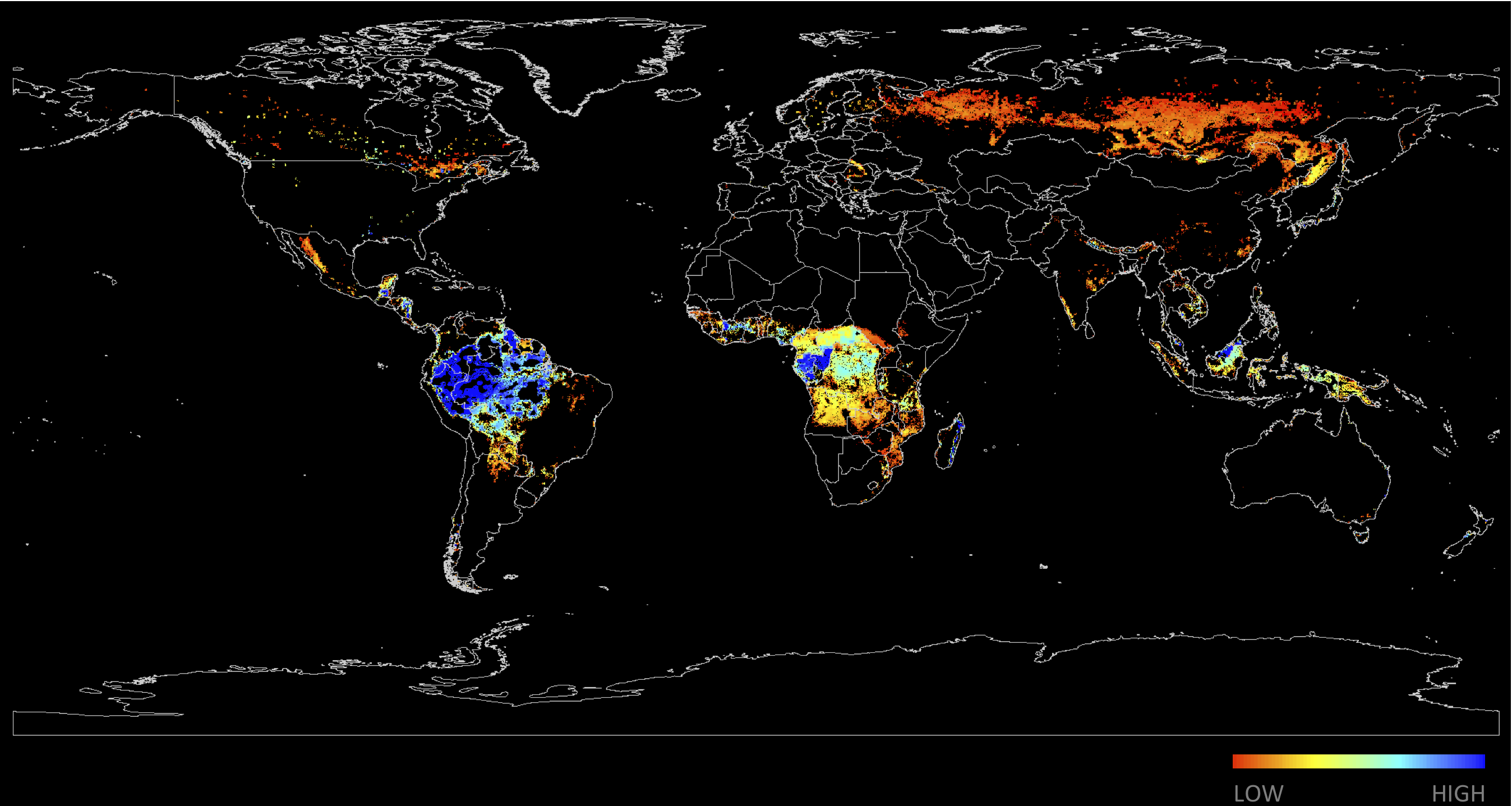
Forest Carbon Index
Robin and I have just completed a year-long contract with Resources for the Future, a freaking-incredible environmental think tank in Washington, DC. While there, we updated and enhanced the Forest Carbon Index (FCI). The FCI is a tool to identify the geographic distribution of potential forest carbon credits, based on both the physical and socio-political characteristics of the world's forests. Operationally, the FCI is the linear combination of multiple datasets -- some derived from satellites, some derived from surveys -- into a measure that is immediately accessible to policymakers. A high FCI value is given to a pixel if (a) there is a relative abundance of stored carbon; (b) there is a low opportunity cost associated with the standing forest; and (c) the pixel is in a country with good governance and able to properly deploy conservation payments. (There are many other factors, but these three explain most of the variation in the FCI.) The map below depicts one realization of the FCI, given a particular parameter set.
Our task was to build a new computational platform for the FCI, so that it could be quickly and easily regenerated with new parameters and base datasets (as they become available). The intellectual legwork for the FCI had already been done and published; and so our task was to revamp the generating process, so that it could be updated and shared with other researchers. Basically, this meant getting rid of ArcGIS -- going open-source -- which is now more feasible than ever. There is a large and growing set of open-source tools for spatial analysis, especially in Python and R. We rebuilt the FCI in Python, and are analyzing the results in R.
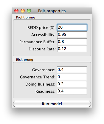
The end-product turned out pretty well, I think. We created a sort of graphical user interface, where users can set parameters to reflect a particular state of the world. The resulting, global FCI is recalculated and mapped in less than 8 seconds at approx. 4km spatial resolution (and slightly longer at higher resolutions). Just about everything is flexible and interchangeable, from the underlying carbon maps to the final parameter set -- even the spatial resolution at which the FCI is calculated. The mapping environment within the matplotlib Python library is interactive, so that users can browse the global maps and take still shots of particular areas, as shown in the screenshot below. But the most useful and interesting output is the country rankings.
Sample output from one particular run of the FCI is pasted below. The countries are ranked by sheer profit potential, not taking into account any socio-political factors. Profit potential, here, is defined as the value of the stored carbon at a given carbon price above the opportunity cost associated with cultivating the land. By this metric, the DRC does well, since the aggregate profit potential represents the quantity of credits and not necessarily the quality of those credits. But the FCI score accounts for the density of stored carbon, as well as national governance and the ability to absorb REDD payments -- measures of the quality of each credit. The average FCI score reveals potential problems with REDD investment in the DRC. All sorts of neat insights come from playing with the parameter set, especially if you try to upset the rankings. At the very least, the interface allows the user to become more fluent with the underlying data.
Next steps for the FCI might include building out the capacity for the interface to calculate forest carbon supply curves on the fly. We have rough, rough estimates of carbon content and agricultural opportunity costs -- enough to estimate rough carbon supply curves, given a certain set of assumptions. This extension may even begin to incorporate the research done as part of the OSIRIS project, which assesses how much countries would be paid to leave their forests intact under a REDD payment scheme -- which is the area under the forest carbon supply curve. This quick calculation could be presented alongside the supply curve itself, within the FCI interface.
This is just a brief exposition of the FCI. There's a lot missing in this short blog post. For more information, please contact us, or visit the FCI site for full documentation.
   ## Sample FCI output
   ---------------------------------------------
   Global Stats (cond. on parameters):

   Number of pixels at $20/tCO2e:         149005
   Mean FCI value:                          11.9
   Median FCI value:                         8.9
   ---------------------------------------------
   Top 20 ranking by profit potential:

   country                        ==>   Avg. FCI

   Congo, Dem. Rep.               ==>      4.908
   Brazil                         ==>     17.599
   Congo, Rep.                    ==>     29.024
   Central African Republic       ==>     10.606
   Angola                         ==>      8.392
   Peru                           ==>     33.028
   Bolivia                        ==>     12.768
   Gabon                          ==>     22.419
   Cameroon                       ==>     10.823
   Indonesia                      ==>     10.649
   Colombia                       ==>     26.474
   Guyana                         ==>     28.024
   Nigeria                        ==>     17.734
   Cote dIvoire                   ==>     13.863
   Madagascar                     ==>     26.237
   Venezuela, R.B.                ==>      7.854
   Russian Federation             ==>      1.686
   Ecuador                        ==>     18.166
   Tanzania                       ==>      8.804
   Papua New Guinea               ==>      9.182
   ---------------------------------------------
REDD Metrics
info@reddmetrics.com
github.com/reddmetrics
